Designing a Dashboard
Chapter 4 — Composing Charts Into One Argument
A dashboard is not a wall of every chart you made — it is a deliberately ordered argument. The previous chapters built the individual views; this one assembles them so a reader answers several business questions in one glance, without getting lost. The same principles apply whether you build it in matplotlib, Power BI, or Tableau.
The Principles
- One idea per chart. If a visual needs a paragraph to explain, split it into two.
- Lead with the headline. The most important view goes top-left, where the eye lands first.
- Establish a visual hierarchy. Size and position signal importance; supporting detail sits lower.
- Be consistent. One colour means one thing across every panel; the same metric uses the same scale and units.
- Remove non-data ink. Drop heavy gridlines, 3-D effects, and borders that compete with the data.
One Screen, Four Questions
The dashboard below answers four different question shapes at once — a trend (how are sales moving?), a comparison (which category leads?), a density map (where and when is sales concentrated?), and a relationship (how does discounting affect profit?). Each panel is one of the charts built earlier in this series, composed onto a single figure with a shared visual language.
Python · pandas + matplotlib
fig, axes = plt.subplots(2, 2, figsize=(11, 7))

# Top-left (headline): the trend
m = orders.groupby("month")["sales"].sum() / 1e6
axes[0, 0].plot(m.index, m.values, linewidth=2)
axes[0, 0].set_title("Monthly sales ($M)")

# Top-right: the comparison
s = orders.groupby("category")["sales"].sum().sort_values() / 1e6
axes[0, 1].barh(s.index, s.values)
axes[0, 1].set_title("Sales by category ($M)")

# Bottom-left: the density map
piv = (orders.assign(mm=orders["order_date"].dt.month)
              .pivot_table(index="region", columns="mm",
                           values="sales", aggfunc="sum") / 1e6)
axes[1, 0].imshow(piv.values, aspect="auto")
axes[1, 0].set_title("Sales: region x month")

# Bottom-right: the relationship
sample = orders.sample(1800, random_state=7)
axes[1, 1].scatter(sample["discount"], sample["profit"], s=8, alpha=0.25)
axes[1, 1].set_title("Discount vs profit")

fig.suptitle("Retail performance dashboard — one screen, four questions")
fig.tight_layout()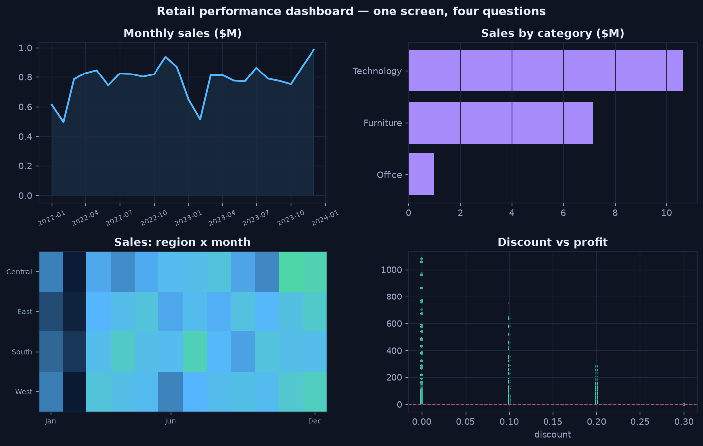
Four question shapes, one screen — the trend leads (top-left), with comparison, density, and relationship supporting it.
Reading the Dashboard
Notice how the panels reinforce one story: sales climb into Q4 (trend), Technology leads the mix (comparison), the year-end lift is broad across regions (density), and deep discounts are where profit leaks (relationship). A good dashboard is composed so those four observations land in seconds — and so the obvious next question ("why does discounting hurt profit so much?") points straight into diagnostic analytics.
The Takeaway
- A dashboard is an argument, not an inventory — order the panels by importance.
- Keep the visual language consistent so the reader learns it once.
- Every panel should answer one question and point toward the next.
That completes the Visualization Analytics mini-series. Continue the lifecycle with Diagnostic Analytics — Why Did It Happen? →